July 2, 2015
GP Physio
Physio Branding
Local physiotherapist Gerhard Pienaar approached CO-UP for a complete brand identity. Firstly we had to establish a scope of requirements. We looked at the website design requirements as well as the overall brand look and feel.
The logo design was a straightforward process. The design is based around the concept of the original logo. We simply took the essence of the original logo and implemented a more modern and contemporary look.
The rest of the brand was built around the specific light blue colour, together with the basic line and simple icon. The business card design resulted in us combining darker greys with light greys. The prescription booklet followed a more traditional design process as we could not deviate too much from medical standards and practices.
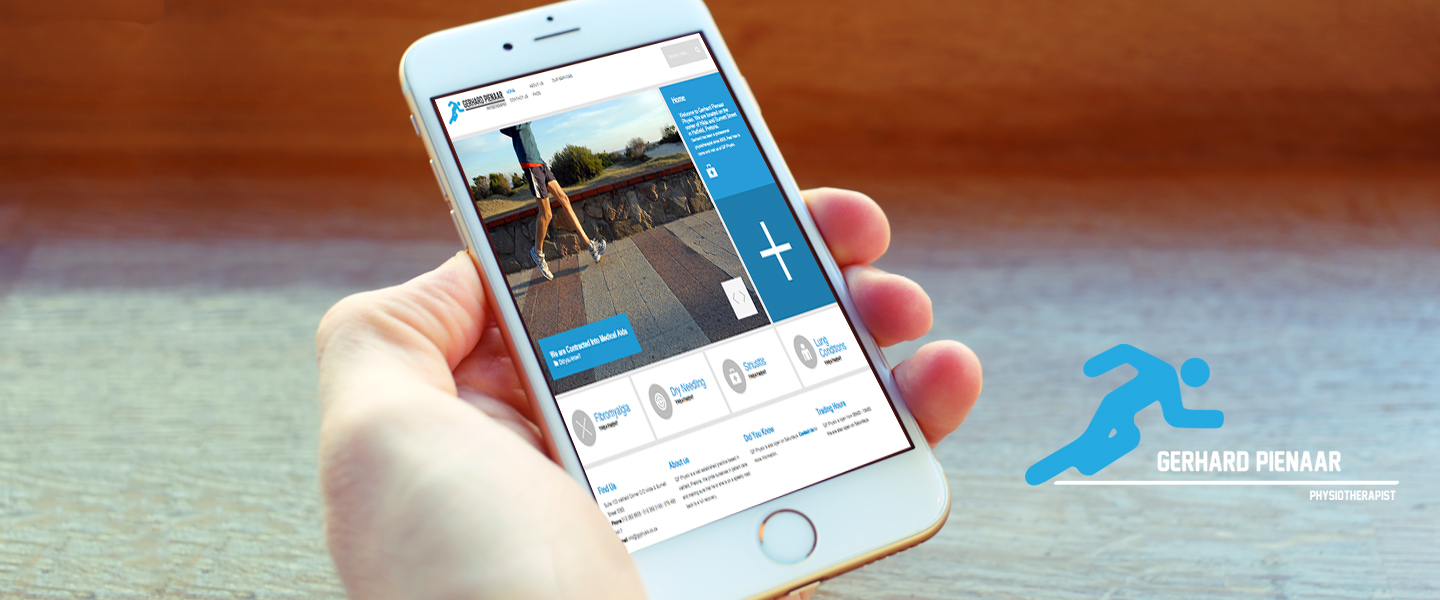
The web design was a lot of fun to implement. The website is very simple, yet elegant and straightforward. From a graphic designer’s perspective this site works well. The website looks good. But the web design also works from the user’s perspective.
Once we completed the website design we started work on indexing. Indexing was a relatively easy process, but generating content proved to be a challenge. We didn’t have a lot of content to work with. Content is king for your website and its online presence. Basic copy was written and optimised for search engines.
Today the GP Physio website is one of the top results when looking for a physiotherapist in Pretoria. The physio branding was a big success story.
You can view their web design here: www.gpphysio.co.za.
Do you need a website design, logo design or any other graphic designer services? Contact CO-UP to discuss how we can help your business reach the next level. Visit our graphic design studio in Pretoria.
