-
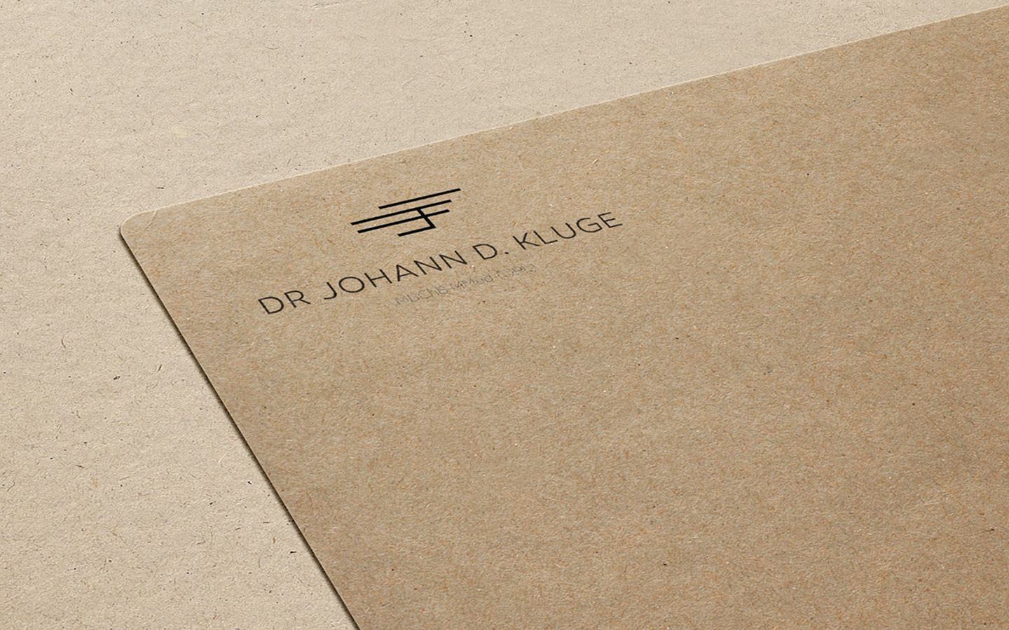
Dr. J.D. Kluge
Corporate Identity Design for Medical Specialist.
June 24, 2015
Dr. J.D. Kluge
Doctor Logo Design
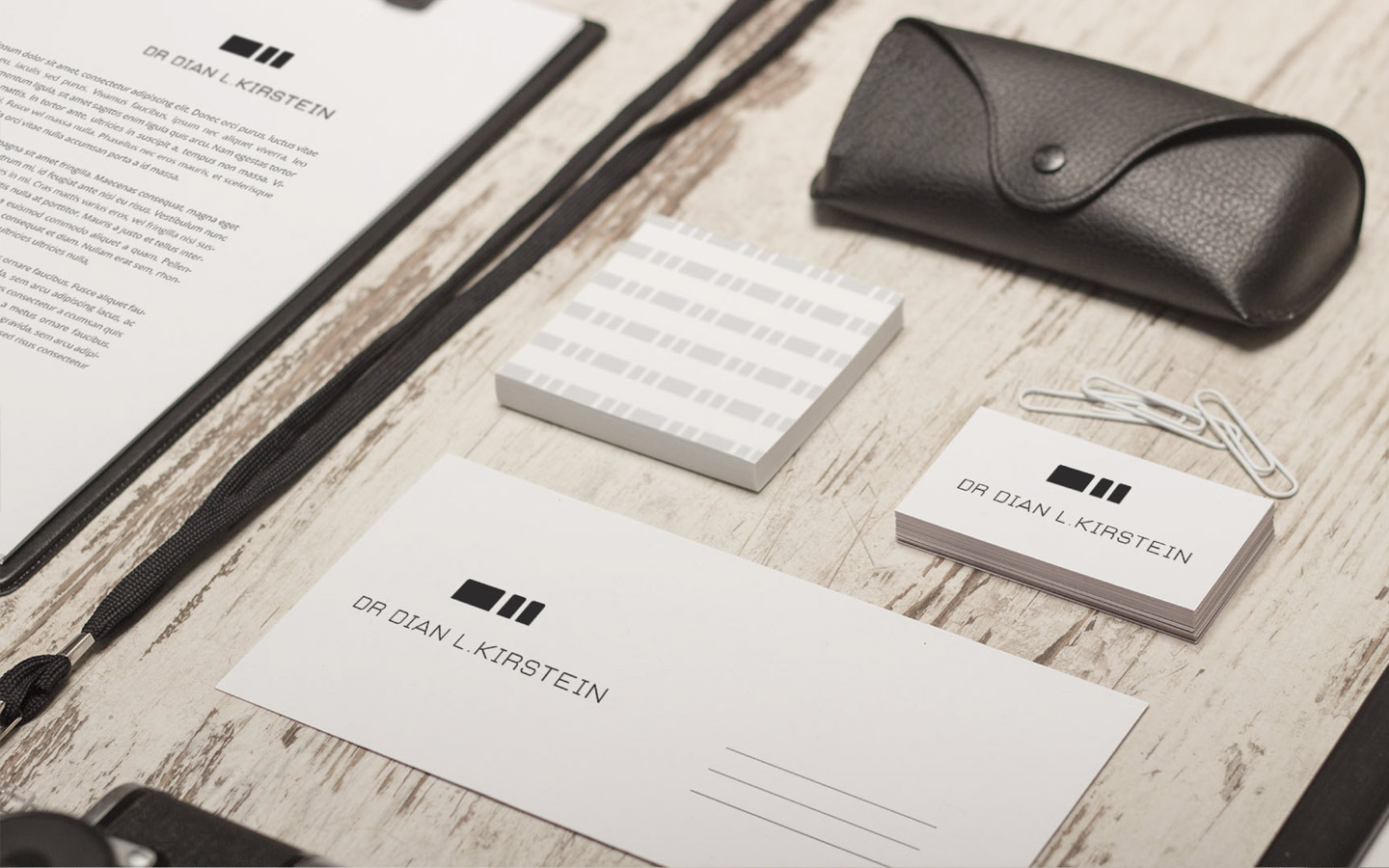
This was a fantastic project to work on. The doctor approached us to create a logo design for his established practice.
The main concept was to create an emblem that resonated with the client, something personal and unique. We created a basic visual alphabet to construct the icon. Each letter of the alphabet represents a code or specific size character. From this basic code alphabet, we isolated the ‘J’ ‘D’ ‘K’ characters in order to create and explore shapes that could be formed with them. From this point, we arranged these three shapes to form the basis of the logo design.
We wanted to have the icon of the logo be strong enough to stand on its own. This created plenty of personalised stationery opportunities. The doctor now has an established brand which looks sleek and timeless, while not conforming to any specific trends.
The icon had to be paired with a clean and simple font in order to convey the environment in which the doctor typically may find himself in, clean, clinical and precise.
This project remains one of our favourites, simply because they saw the vision we wanted to realise and trusted us to carry it out. The end-result was one that both designer and client were extremely pleased with. To date, this remains our personal favourite logo design. We are extremely satisfied with the doctor logo design.

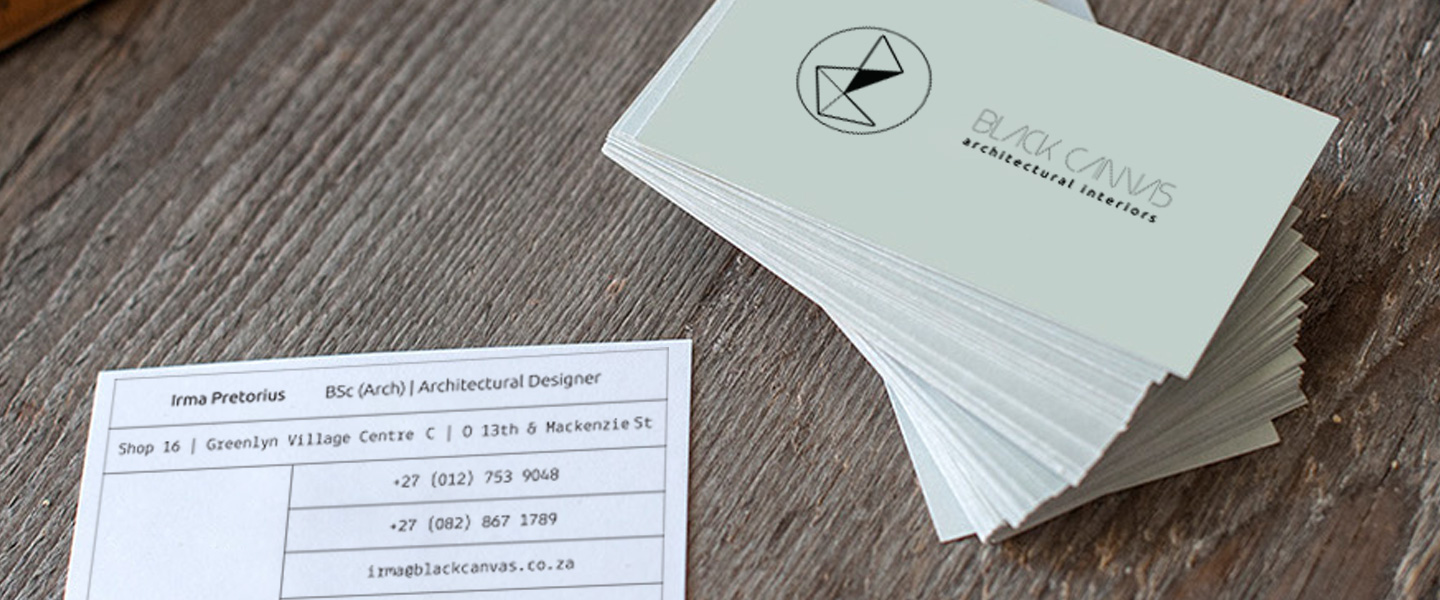
Do you require more than a logo design? Chat to our affiliates at Black Canvas. Keep checking their portfolio for the work done on Dr. Kluge’s Consultation rooms.
Do you require a logo design, a website design or any other graphic design services? Chat to us here at CO-UP / brand initiative studio today. We offer premium graphic design services at affordable rates.
Let’s UP your brand today.